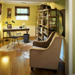
Small home office mistakes pop up on the internet despite the best of intentions. This photo appeared in an online article on small home office ideas for the do-it-yourselfer. I came to a complete stop when I saw this picture. This home office is attractive but its set-up and layout needs some serious re-thinking. What’s…There’s more. Click here.
Looks Beautiful, Not Functional Home Offices
A series of reviews of home office design examples and new ideas that will improve your home office so it is not only lovely to look at, but enjoyable to work in.
Home Office Design – Chair and Desk Out-of-sync – Looks Beautiful, Not Functional
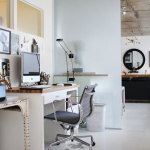
Home Office Design Inspiration Often Falls Short This photo accompanied an article about a foolproof way to align your desk chair height for comfortable computer monitor viewing. This photo is an example of how difficult, if not impossible, it is to find an illustration of attractive home office design that is ergonomically savvy. This home…There’s more. Click here.
Home Office Furniture: You’re Only As Good As Your Hardware
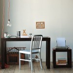
Last month I was in a popular home furnishings store and saw a parson’s table desk similar to this. It had a brushed metallic foil finish which had an intriguing textural quality that I liked. Then I pulled out the little drawer. It wobbled and stuck. I tried a different parson’s desk and had the…There’s more. Click here.
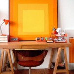
Mid-Century Modern Style Home Office Needs Twenty First Century Function
The photos I see over and over in the media (television and online) of home offices Look Beautiful, but are Not Functional. I am amazed at the creativity and vision of many of them, but they are not set up to really work, let alone work for you. This is the first of a series…There’s more. Click here.


